
Making insurance value more accessible
An award winning project on how we visualised insurance value – information became more accessible to our customers. The case studies shared some of our design iteration, how we evolved from day 1 to the final solution.
📁 Project
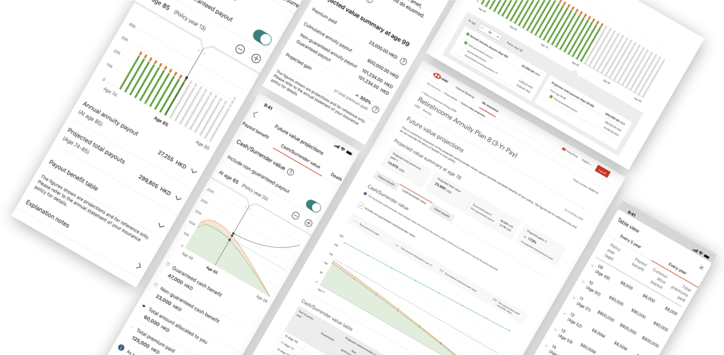
HSBC Future Value Projections (2019–Now)
💪 My role
Leading the UX UI team (2 designers)
Coordinating with product owner, product team, stakeholders and development team
📍Market
Hong Kong
👥 Target audiences
All existing life insurance customers in HSBC HK. Around 350,000 customers.
—
What are the challenges faced by customers?
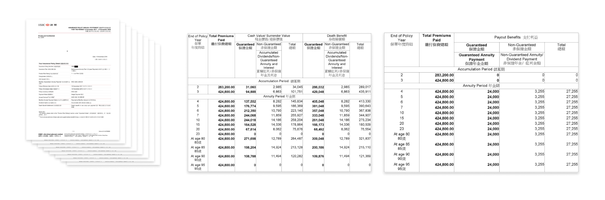
Customers had to read a 8-page annual statement
💣 Information overloaded
It is a 8-page statement with tables and fields with technical terms that was considered difficult and unenjoyable to read.
⌚ Non-real time
The annual statement was sent to customer once a year. Therefore by the time customer wanted to learn about their value, the number was no-longer up-to-dated.
🗑️ Probably missed it
As customer received it only once a year, by the time users want to read it, chances are you they lost it.
—
What are the challenges faced by our business stakeholders?
Customer service team said
💬 It happened almost everyday that customers queried around policy current and prospective value.
We chatted with our customer service team who answered the call from our customers, who mentioned the queries around policy current and prospective value would be the second highest asked question (first is premiums related)
Operation team said
💬 We had to specifically issued off-cycle statement to inform customers their current & future policy value.
As statement isn’t up to dated, therefore, we often received customers request in getting an off-cycle statement with the latest policy value and an more accurate future value projection.
—
How might we…
How might we help users to access to their insurance value more effectively and conveniently ?
How might we present complex insurance value into digestible information?
Solution have to
✅ Access anytime with real time updates with mobile(main focus) & desktop journey
✅ Information was presented in digestible format without bombing users all the information
—
Research and Analysis
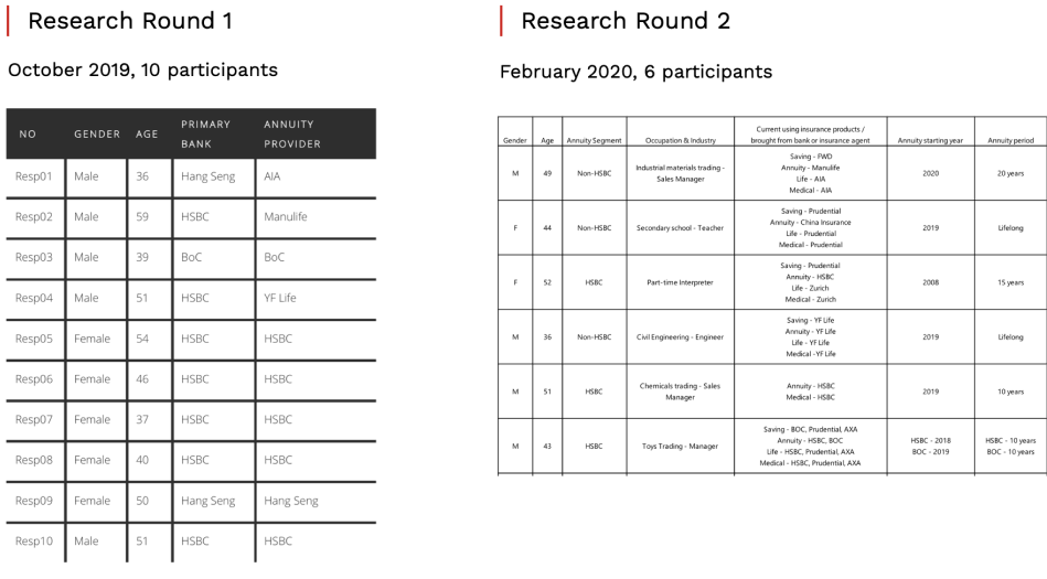
#1 Externel user testing
🧑🔬 16 participants
📅 Oct 2019 and Feb 2020
🧪 User interview + Usability testing
⌛ 60min/ participant
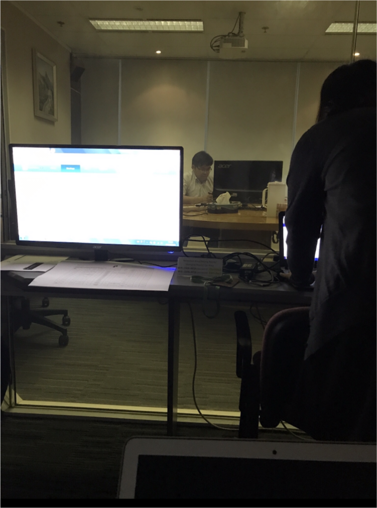
User testing setting
guerrilla testing
#2 Guerrilla testing
This is my favourite type of research – it helped us to solve problems efficiently whenever we need feedback or we had disagreement.
🧑🔬 uncountable participant number
📅 every week
🧪 AB testing/ Usability testing
⌛ 5-30min/ participant
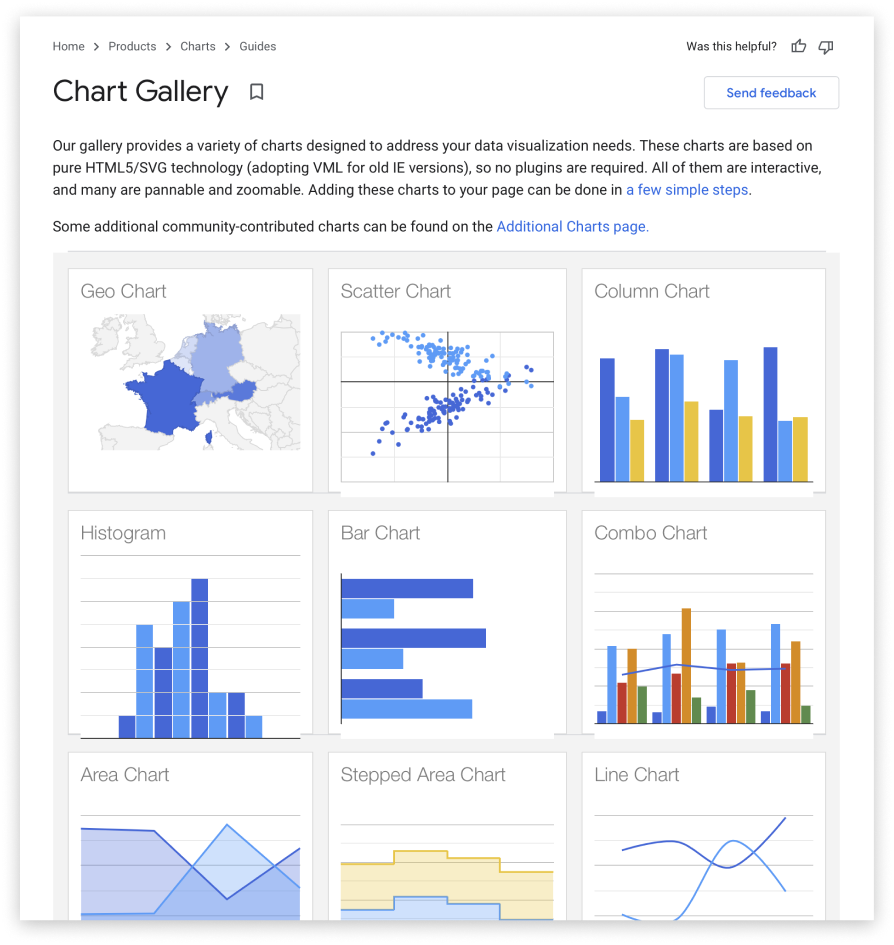
One of the exercise – studying what google chart can achieve
#3 Technical feasibility analysis
To make our journey possible, it is also highly about what we can achieve with our capability. We constantly communicate with our development team to understand and explore possibility as a team.
🧑🔬 technical teams across India & Hong Kong
📅 daily standup
❗ don’t take “NO” so easily
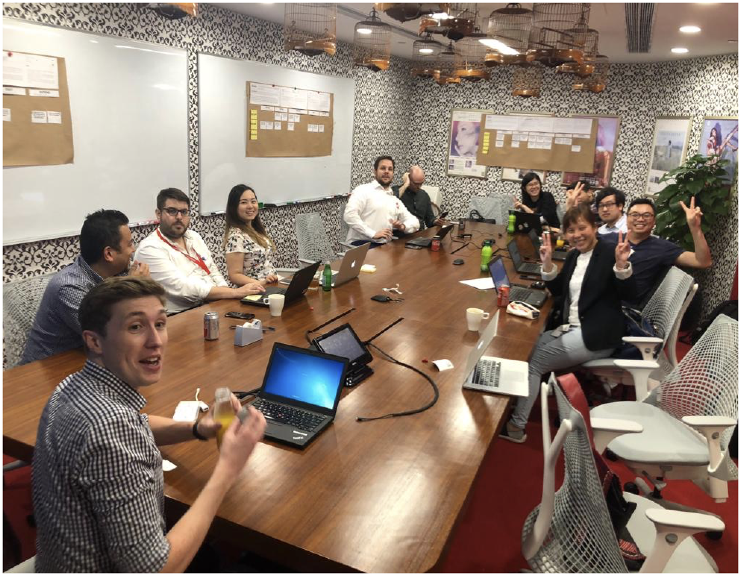
happy break time during our business workshop
#4 Workshop with business stakeholders
We also work super closely with our business stakeholders to make sure we deliver product that fit into business perspective.
🧑🔬 distribution team, customer service team, operation team, legal team
📅 weekly connect
—
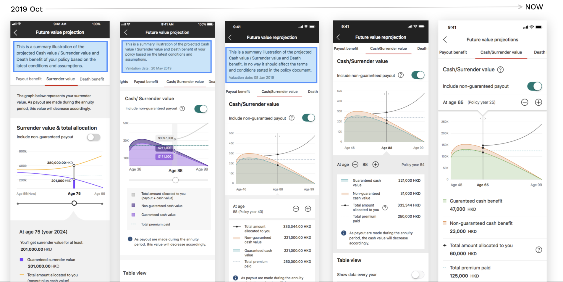
The design iteration
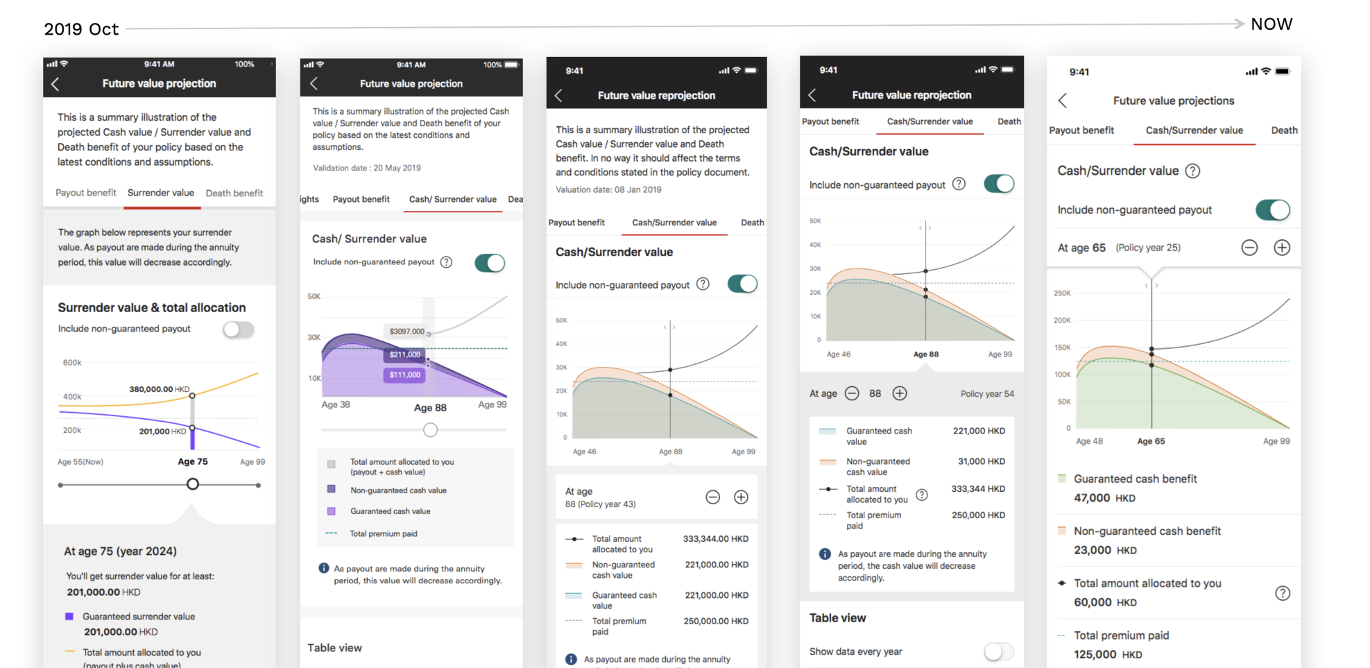
This project is about how we keep iterate and improve based on customers’ expectation. The following will show you some examples of how we have iterated.
P.S. the examples are just an tiny iceberg tip of the whole project
—
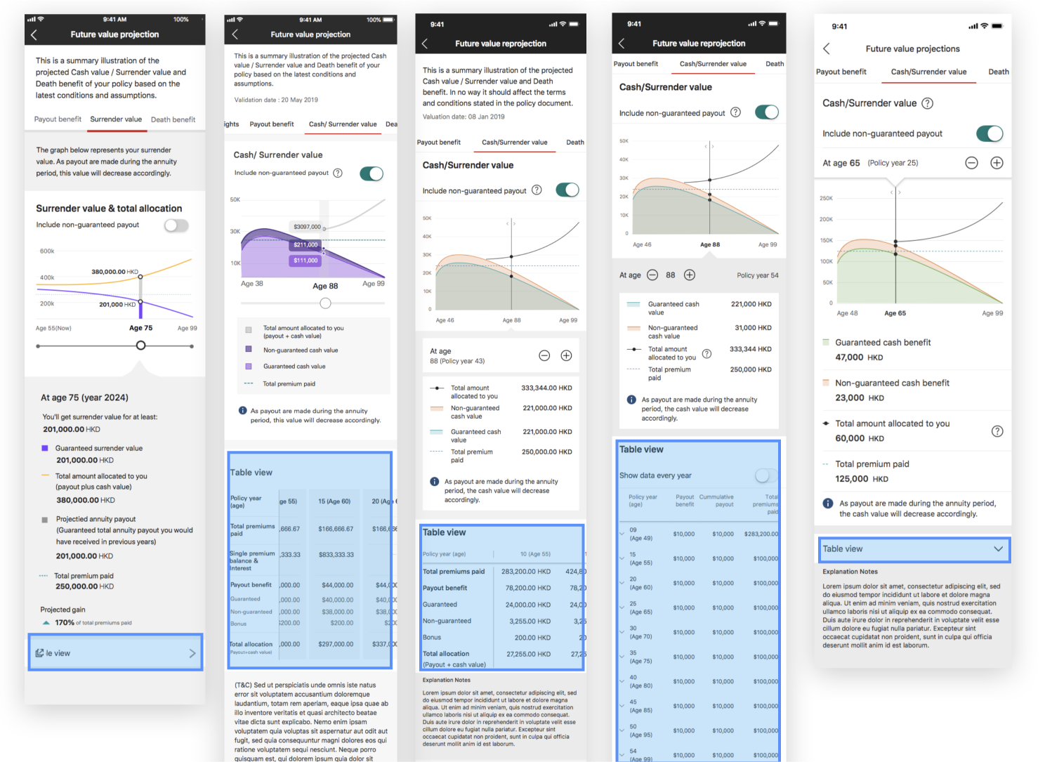
Iteration example #1
Moving the intro text in a separate tab
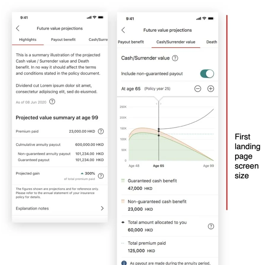
🔎 What we’ve learnt
The text was frequently overlooked and was considered unimportant by participants as their attention was on the content/charts and graphs
In some cases is having a detrimental affect as it’s pushing critical information (chart/graph/legend) under first landing screen size.
Communicate with legal team and learnt that as long as the text is shown prominently, it didn't have to shown on each page.
💡 Solution
There is no need to keep the introduction for all tabs
Move the information into the first landing tab as a introduction page
Try to fit as much graph as possible in one screen size (we use iPhoneX as benchmark according to our data)
—
Iteration example #2
The sliding interaction
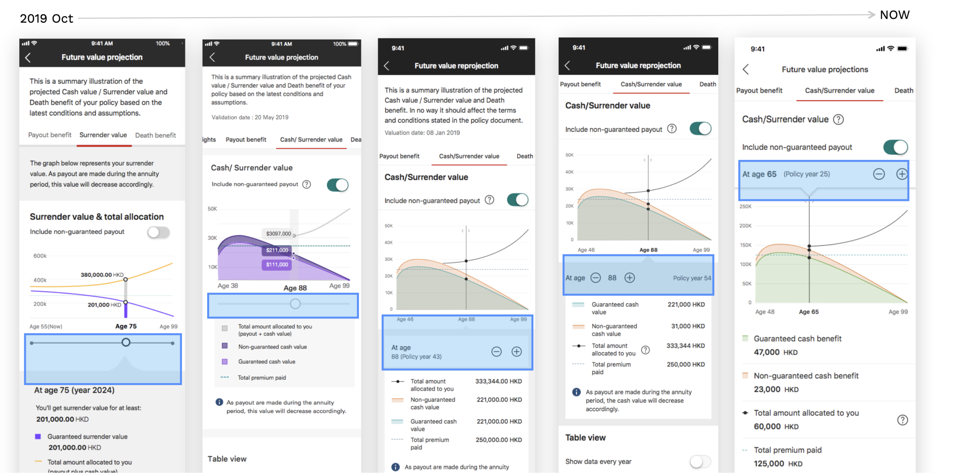
💡 Solution
Minimise the slider design (do not need a slider)
Move the interaction on the top so that user can easily read the graph, legend and number at the same time.
🔎 What we’ve learnt
Customer was reading the graph, legend and number at the same time.
However, the age/slider is standing in-between those information.
other exploration of sliding behaviour, we also discussed interaction possibilities with technical team
—
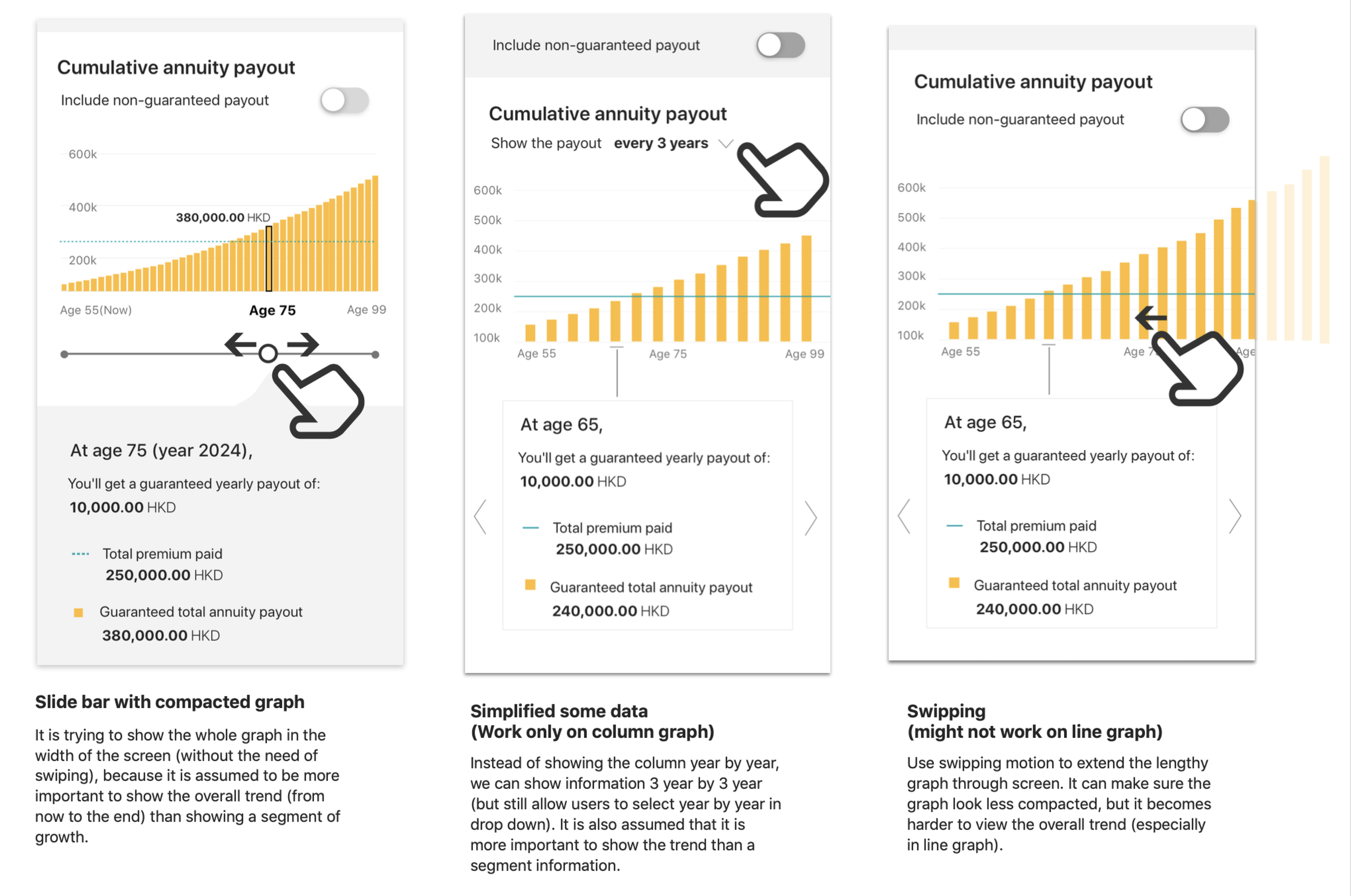
Iteration example #3
Table design
🤔 Where should we position the table?
🔎 What we’ve learnt
Users preferred graph view way more than table view, as they are more interested in viewing the trend.
Users will look for table only if they wanted to know the actual numbers in detail.
💡 Solution
To show the table as a separate modal so as to focus on the graph view
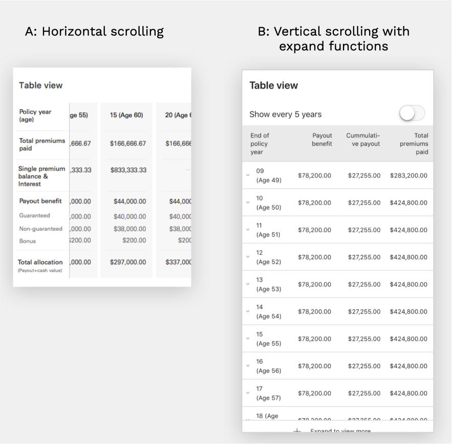
🤔 Horizontal scrolling? Vertical scrolling?
🔎 What we’ve learnt
From A/B testing, we found horizontal scrolling was considered an undesirable behaviour, with horizontal scrolling being harder to control.
We also connected with our accessibility & tech team to understand the feasibility and limitation.
Vertical scrolling table allow user to view more data in one glance and easier to compare the numbers across different years
💡 Solution
Go for version B, an interaction that is more familiar to our customers
It allowed a easier way to control the page and compare the numbers
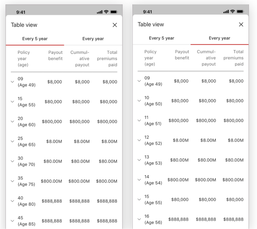
🤔 How to accommodate a lengthy table (up to 60 rows)?
🔎 What we’ve learnt
When we studied on existing actual numbers, we identified the table could go extremely long, like 60 row of data as information is shown by year
Users was more interested toward trend than the actual numbers of each year
💡 Solution
Therefore, we provided a option for users to read the data for every 5 year or every year
Default to be shown by every 5 year
—
The full journey
a video that walkthrough the design
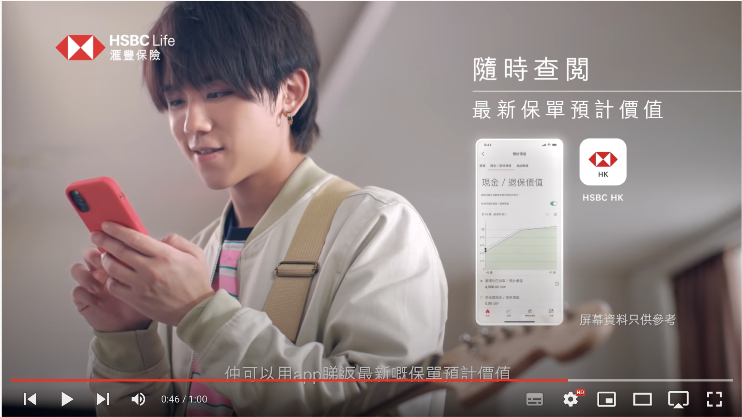
We have Keung To featuring our project in a TV ads (He is probably the most famous pop star in HK!)
Result highlight
🗳️ +57 NPS score
☝️ Around 5K visit per week
📄 Half of the off-cycle statement request reduced
What I wish to do differently?
🧐 Understand and rethink the annual statement experience
It is still inevitable that we’ll still send statement to our customers, however, we haven’t look into how to better improve the statement experience itself.
🤝 Better connect the physical statement to digital experience
There is a lack of connection of how customers can experience the journey in different platform, from paper statement to digital solution to customer service.
📃 Rethink on what content is needed
When the project started - Instead of replicating content inside the statement, there might be information that customers are looking for but not shown, e.g. break-balance.
—
Special highlight 🎉 🎉 🎉 🎉
We won some awards for this project!
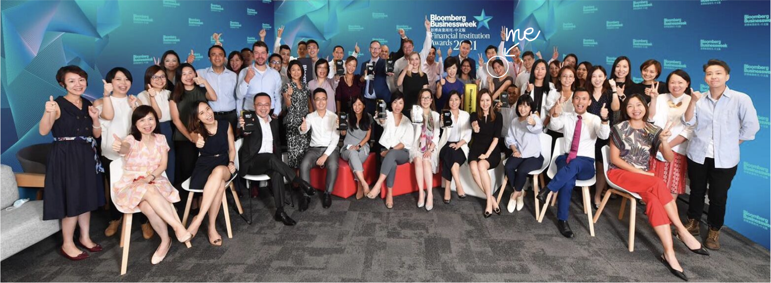
Bloomberg Businessweek Financial Institution Awards 2021
🏆 Digital Innovation
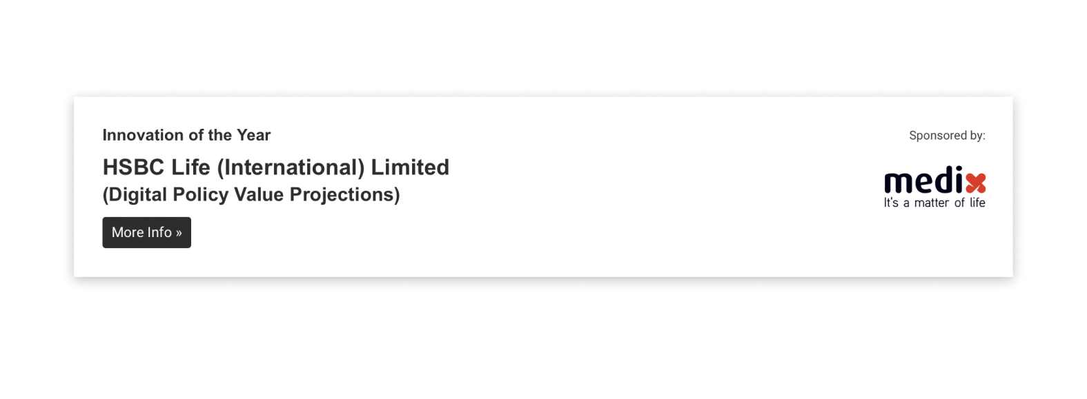
Asia Insurance Industry Award
🏆 Innovation of the Year
—
Behind the scene
It’s a huge and amazing team effort!
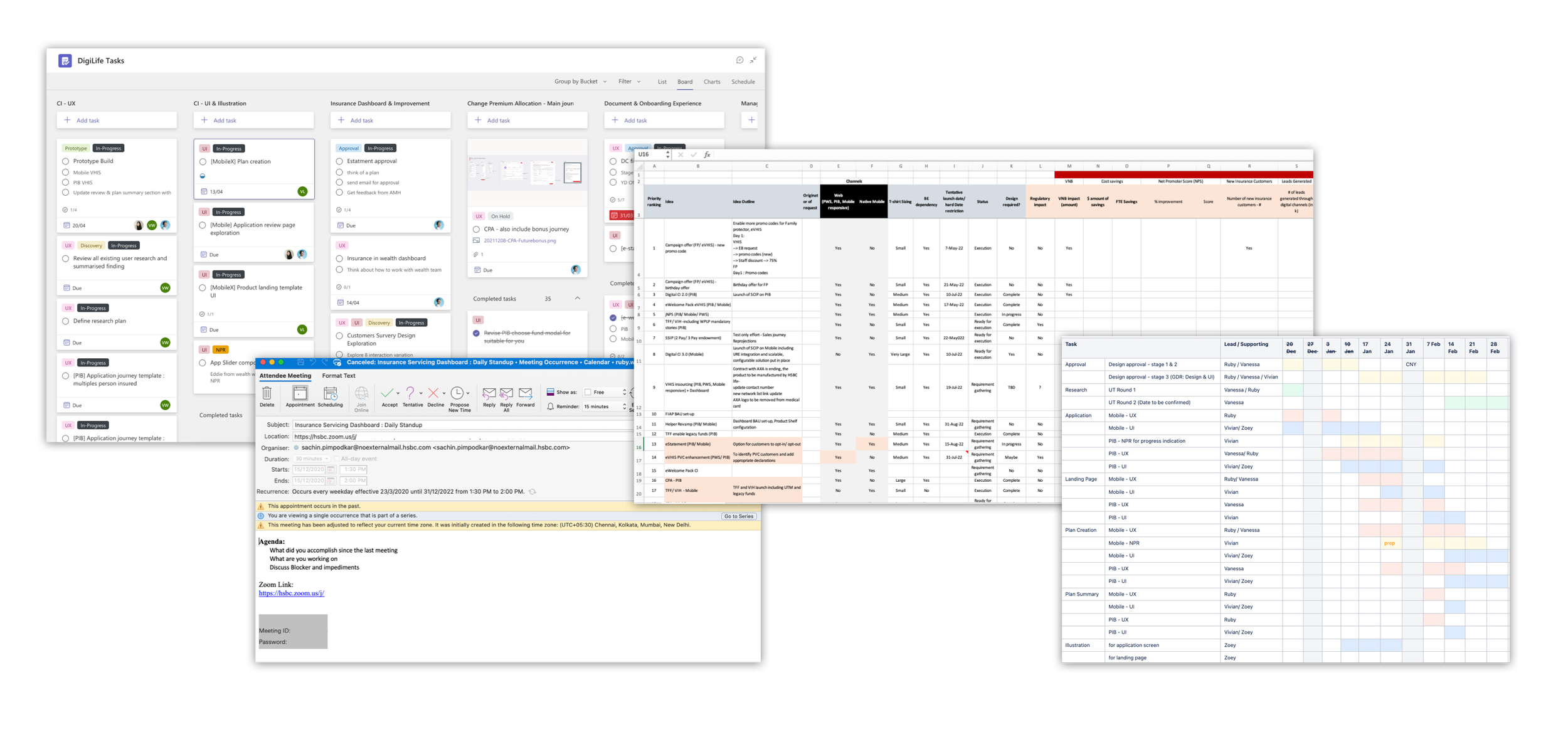
In order to make the design come true, communication and planning is the key
My role: Manage design task and deliverables with design task board & gantt chart
Me and product manager: Feature and project prioritization with different parameter
Product team + development team: Daily standup to discuss any issues
—
We don’t stop improving
#1 Evaluate our data
After we have launched, we regularly identify our data to evaluate the experience, what are the most interacted information/ tab/ tooltips.
#2 Chat with customer service team
Our customers service team can also give us insight on what customers are asking or complaining.
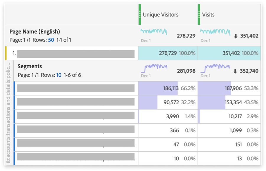
a screencap of our adobe analytics
—
We’ve identified our next step…
What we found
☝️ One of the most clicked tooltip – Pessimistic/optimistic value prediction
☝️ Most visited tab – Cash value
☝️ Mobile view visit was 4-times higher than desktop view
💬 One of the most commonly asked question from customers – How accurate is the future value?
Therefore, we started to brainstorm the idea of
📈 A more accurate presentation that show a pessimistic/optimistic range
📱 Let’s again start by mobile version
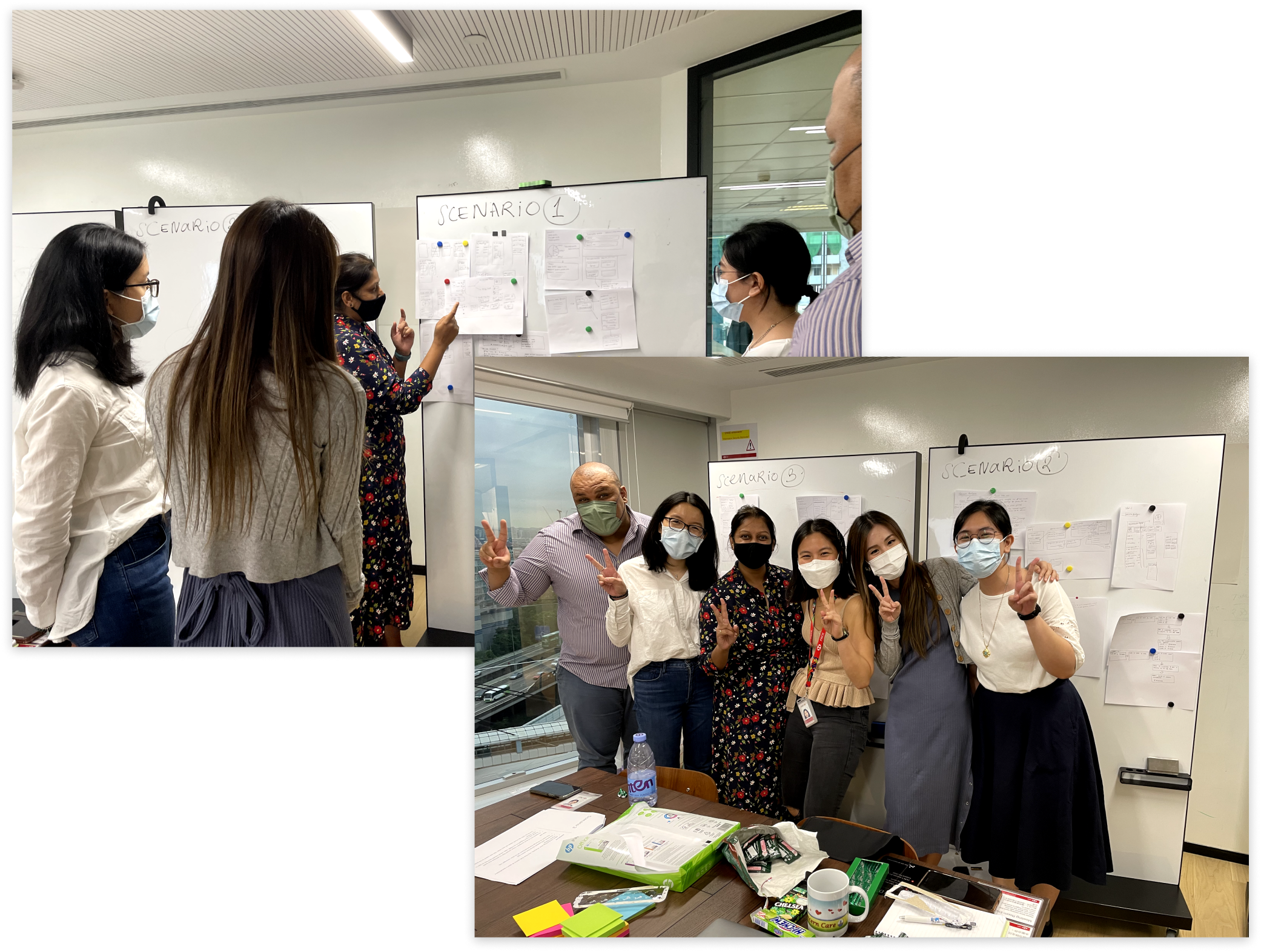
I held a workshop to brainstorm and sketch together